
Table of contents
After getting a grip on reactivity and component communication, let's look at what basic features remain. Take slots and attributes. We use them mostly in templates. But what if you must access them in your script? Say, to write a functional component?
Functional components
The official docs recommend using HTML templates whenever possible. And in most cases, you don't have to access attributes and slots programmatically.
When using functional components, you're essentially skipping Vue's template compiling process. Instead of HTML, you pass virtual node declarations into the framework's renderer pipeline. And without templates, there's no place to nest attributes and slots.
You'll notice that in the end we'll still use templates. Bear with me.
This can be super useful in cases where you need low-level control of how your app behaves. But it comes at the cost of an extended boilerplate.
Attributes and slots
Attributes in Vue 3
If you've carefully read my previous article about v-model - binding, you probably noticed a v-bind directive that went along unexplained:
<input
    class="input__field"
    v-bind="$attrs"
    :placeholder="label ? label : ''"
/>
$attrs includes a map of all HTML - fallthrough-attributes that were passed into the component. It is automatically provided by Vue when the component is mounted. By using v-bind, we can declaratively bind the map to the input element. Else, Vue will bind them to the outer div. Especially for accessibility attributes, we would prefer the former.
Attributes are only available in the template. If we wanted programmatic access to them we must make use of the useAttrs helper.
import { useAttrs } from 'vue';
const attrs = useAttrs();
Slots in Vue 3
At some point, props will not satisfy your app's need for dynamic content. That's when slots come into play. They allow you to inject whole templates into child components.
Assume you had a AppCard.vue component. It acts as an outer, styled layer for its content and looks something like this:
<template>
    <section class="card">
        <header class="card__header">
            Some card header
		</header>

		<main class="card__body">
            This is some card content
		</main>

		<footer class="card__footer">
            This is a card footer
		</footer>
	</section>
</template>
We can replace the static content with named slots:
(back to 'A functional container component')
<template>
	<section class="card">
		<header class="card__header">
            <h3>
                <slot name="header" />
            </h3>
		</header>

		<main class="card__body">
			<slot name="default" />
		</main>

		<footer class="card__footer">
			<slot name="footer" />
		</footer>
	</section>
</template>
And, in the outer component, pass in slots with the v-slot:<slotname> - syntax:
<template>
    <app-card>
        <template v-slot:header> Card header</template>
		<template v-slot:default>
            <p>
                Lorem ipsum, dolor sit amet consectetur adipisicing elit.
                Enim ipsa ullam culpa explicabo amet alias nemo!
			</p>
		</template>
		<template v-slot:footer> Card footer </template>
	</app-card>
</template>
To access slots programmatically, we must use the useSlots helper exported by Vue:
import { useAttrs } from 'vue';
const attrs = useAttrs();
A functional container component
Let's stick with the card sample for a moment. What if you wanted to have a different tag wrapping the card? Or a smaller heading for the headline? Say h4 instead of h3?
Problems like this can hardly be solved in a static template. Functional components shine here - they provide the necessary flexibility and require (almost) no template.
Let's showcase this. We'll want to build a more flexible container component. It should always:
- have margins to the left and right
- fill 100% of the horizontal viewport, but not more than 1200px
Additionally, it should come in two combinable variants:
- centered - all elements inside the container are horizontally and vertically centered
- page - the container fills 100% of the vertical viewport
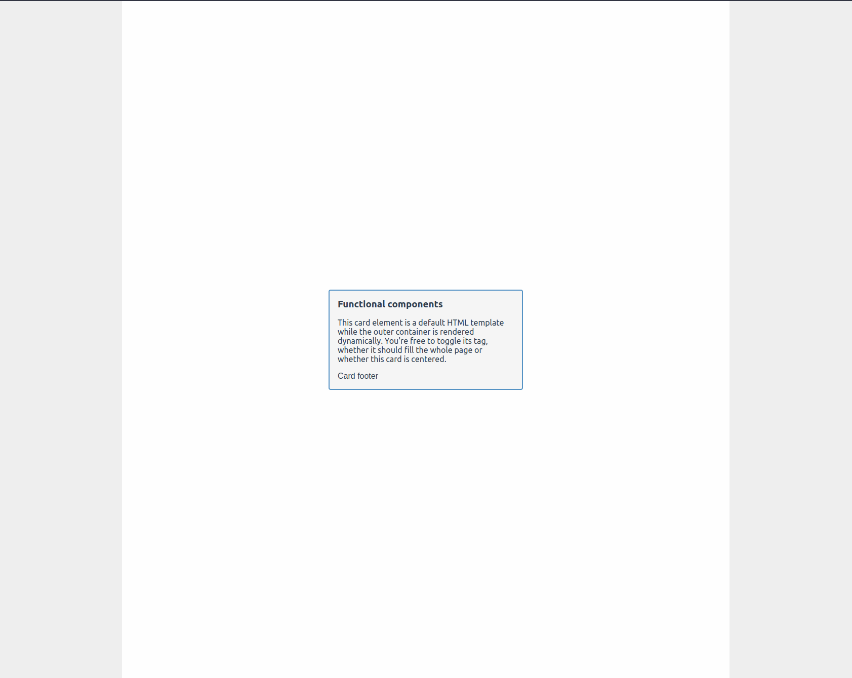
The result will look like this:
Start with this Github repos. Clone it to your local machine and:
- create the
AppContainer.vuecomponent insrc/components/ - (optional): create the
AppCard.vuecomponent insrc/components/and fill it with the dynamic component of 'Slots in Vue 3' - grab the below boilerplate code and add it to the respective file
AppContainer.vue
<script setup lang="ts">
import { h, Component, useSlots, useAttrs } from 'vue';
interface AppContainerProps {
	tag: keyof HTMLElementTagNameMap;
	page?: boolean;
	centered?: boolean;
}
type AppContainerClass = 'container--centered' | 'container--page';

const props = withDefaults(defineProps<AppContainerProps>(), {
	tag: 'div',
	centered: false,
	page: false,
});

const propClassMap: {
	prop: keyof AppContainerProps;
	class: AppContainerClass;
}[] = [
	{
		prop: 'centered',
		class: 'container--centered',
	},
	{
		prop: 'page',
		class: 'container--page',
	},
];

const assembleContainerClasses = () => {
	let containerClasses = ['container'];
	propClassMap.forEach((entry) => {
		if ([props[entry.prop]]) {
			containerClasses.push(entry.class);
		}
	});
	return containerClasses;
};
</script>

<style scoped>
.container {
	background-color: var(--background-color-tartiary);
	margin: auto;
	width: 100vw;
	max-width: 1200px;
	padding-left: 5rem;
	padding-right: 5rem;
}

.container--centered {
	display: flex;
	flex-grow: 0;
	flex-direction: column;
	align-items: center;
	justify-content: center;
}

.container--page {
	min-height: 100vh;
}
</style>
A lot is going on here. Let's walk through it from the top.
- We import the necessary helpers from 'vue'
- We declare an interface and a type. These will provide shape to our functional component's props and utilities
- We declare the component's props
- We create a
propClassMap. It builds a reference between the component's properties and the CSS classes they are meant to apply - We declare a utility function
assembleContainerStyles. It'll be called once when the component is created and apply the required CSS classes - Finally, we declare the CSS styles themselves below the
scripttag
Declare attributes and slots
Add these lines of code right below the component's props:
const slots = useSlots();
const attrs = useAttrs();
Declare the component
Add the following lines of code right below the assembleContainerStyles - function:
Inside the script tag
const AppContainer: Component = () => {
	return h(props.tag, attrs, slots);
};
Below the script tag
<template>
    <app-container :class="assembleContainerStyles()">
		<slot />
	</app-container>
</template>
Add the component to the parent component
What's left to do is to add the following code to your App.vue file:
<template>
	<app-container tag="main" :page="true" :centered="true">
		<app-card>
			<template v-slot:header> Functional components</template>
			<template v-slot:default>
				<p>
					This card element is a default HTML template while the outer container is rendered
					dynamically. You're free to toggle its tag, whether it should fill the whole page or
					whether this card is centered.
				</p>
			</template>
			<template v-slot:footer> Card footer </template>
		</app-card>
	</app-container>
</template>
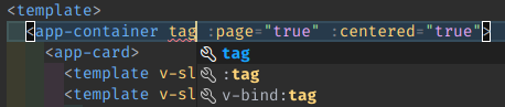
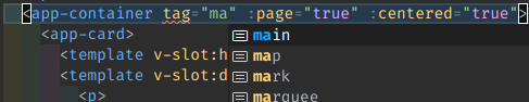
Again, if you have the Vue Language Features extension enabled in VSCode, you'll be happy to see intelligent code autocompletion also works for functional components:
Hold on. But why the template in AppContainer?
You might wonder: Why is there still a template? Weren't we creating a functional component?
That's perfectly true. You could achieve the same result using functional syntax. I personally prefer having Single File Components as my project's foundation. But with Vue 3, achieving the same result using a functional approach in a .ts - file is easier than ever before.
Note that the official docs state that the performance gained using function syntax became neglectable in Vue 3. Read more about it here.
If this answer does not satisfy you, I'll be happy to see how you build this component with pure functional syntax. Please let me know about your learnings and if there are edge cases in which SFC syntax really cannot be used.
