
A dark mode feature can be a bliss for your webapp's users. It reduces stress on the eye in low-light conditions and can also help saving energy on the device. In this post, you'll learn how to write your own Vue.js component to add it to any newly created - or already existing project with ease.
Table of contents
Implementing dark mode in your web app will be sugar for your night owl readers. It implements a high-contrast color scheme that's soothing for the eyes when one's background light is dimmed or even absent. Toggling between dark - and light mode is a must-have for modern websites. So read on to learn how to write your own reusable Vue.js component to implement it.
The TL: DR - Code Sandbox
If you're after the component's source, check out this code sandbox.
immutable-monad-cotsz - CodeSandbox
immutable-monad-cotsz by tq-bit using @vue/cli-plugin-babel, vue
Make sure to consider these two core points:
- From
App.vue, copy the:rootand:root.dark-themestyles and add them to your own project's structure. - Then, copy the whole content of
ThemeButton.vueinto your own component file
You can then import and use <theme-button /> component wherever you would like to use it.
Update: Vue 3 TS + Composition API
In case you're looking for component that uses Vue 3's decoupled approach. You can find the code at the end of this article.
Click here to jump right to it
Getting started & prerequisites
To follow along on your local machine, you will require a working version of Node.js and your favorite text editor, such as Visual Studio Code. While not mandatory, some experience with Vue or another Javascript framework will come in handy.
Create the app
This project will use Vite.js for bootstrapping. It's a toolkit comparable to the Vue CLI. Change to a directory of your choice and execute the following commands.
# Generate a vite-based app in the current directory
npm init @vitejs/app .

# Give the package a name, then install the necessary node modules
npm install && npm run dev
This will create a fairly lean app structure based on @vitejs/create-app - perfect for our use case.
For the sake of simplicity, the following steps will all happen inside the App.js file.
I would encourage you to try and use a separate component though.
Create the base component structure
Now that the app is set up, let's start with some basic component structures.
Replace all contents of the App.vue file with the following:
<template>
<div class="container-center">
<div class="card">
<input
@change="toggleTheme"
id="checkbox"
type="checkbox"
class="switch-checkbox"
/>
<label for="checkbox" class="switch-label">
<span>🌙</span>
<span>☀️</span>
<div
class="switch-toggle"
:class="{ 'switch-toggle-checked': userTheme === 'dark-theme' }"
></div>
</label>
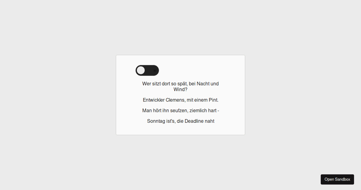
<p>Wer sitzt dort so spät, bei Nacht und Wind?</p>
<p>Entwickler Clemens, mit einem Pint.</p>
<p>Man hört ihn seufzen, ziemlich hart -</p>
<p>Sonntag ist's, die Deadline naht</p>
</div>
</div>
</template>
<script>
export default {
  mounted() {
    const initUserTheme = this.getMediaPreference();
    this.setTheme(initUserTheme);
  },

  data() {
    return {
      userTheme: "light-theme",
    };
  },
};
</script>
<style>
html, body {
  padding: 0;
  margin: 0;
}
/* Define styles for the default root window element */
:root {
  --background-color-primary: #ebebeb;
  --background-color-secondary: #fafafa;
  --accent-color: #cacaca;
  --text-primary-color: #222;
  --element-size: 4rem;
}

/* Define styles for the root window with dark - mode preference */
:root.dark-theme {
  --background-color-primary: #1e1e1e;
  --background-color-secondary: #2d2d30;
  --accent-color: #3f3f3f;
  --text-primary-color: #ddd;
}

p {
  color: var(--text-primary-color);
}

.container-center {
  background-color: var(--background-color-primary);
  height: 100vh;
  width: 100vw;
  display: flex;
  align-items: center;
  justify-content: center;
}

.card {
  padding: 2rem 4rem;
  height: 200px;
  width: 300px;
  text-align: center;
  border: 1px solid var(--accent-color);
  border-radius: 4px;
  background-color: var(--background-color-secondary);
}
</style>
Then start your vite dev - server using npm run dev. You should see this when opening your browser:
Style the checkbox to look like a switch
Style the checkbox element
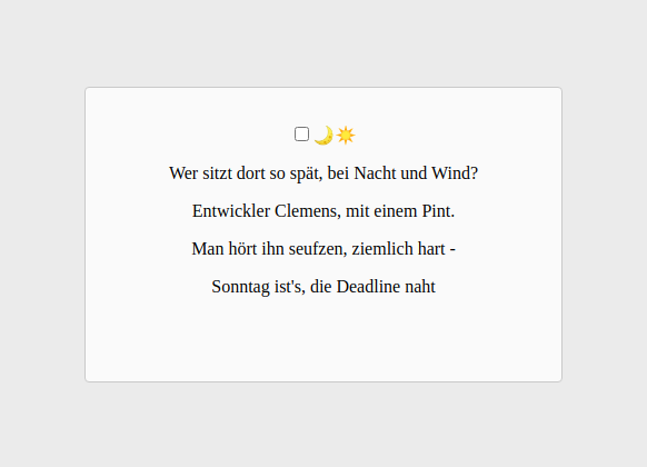
Since there is no browser-native switch element, we'll create our own. The easiest way to do so is by making use of the connection between an input element and the label that describes it.
To do so, we have to make sure that the for attribute in the label tag points at the correct input element's id. In this case, both of them are named checkboxes. Doing so will cause a click event that hits the label to be reflected by the checkbox.
That means: We can get rid of the checkbox and focus on styling the label.
Let's start by adding the following to the style - part of the App.vue file:
.switch-checkbox {
  display: none;
}
Style the checkbox label
Next, let's look at the background. The switch is meant to be a component, so we have to make sure it's easily reusable and flexible for other applications. For that, let's take a step back and look into the :root CSS we've parsed before.
In case you're unfamiliar with this approach: Inside the root scope, you can define globally valid CSS variables. These can be used all across the app and offer great potential for reusability. If you're curious, read more about it on MDN
:root {
  --background-color-primary: #ebebeb;
  --background-color-secondary: #fafafa;
  --accent-color: #cacaca;
  --text-primary-color: #222;
  --element-size: 4rem; /* <- this is the base size of our element */
}
To give us a bit of flexibility regarding the switch's size, we'll make use of the --element-size CSS variable and use the calc() function to compute all other dimensions based on it. Since the width of the label is its biggest measurement, we'll bind its value to our root's variable.
In a nutshell: We'll use one css variable to describe the scale of the switch
With that in mind, add the following to the style - part of the App.vue file:
.switch-label {
  /* for width, use the standard element-size */
  width: var(--element-size);

  /* for other dimensions, calculate values based on it */
  border-radius: var(--element-size);
  border: calc(var(--element-size) * 0.025) solid var(--accent-color);
  padding: calc(var(--element-size) * 0.1);
  font-size: calc(var(--element-size) * 0.3);
  height: calc(var(--element-size) * 0.35);

  align-items: center;
  background: var(--text-primary-color);
  cursor: pointer;
  display: flex;
  position: relative;
  transition: background 0.5s ease;
  justify-content: space-between;
  z-index: 1;
}
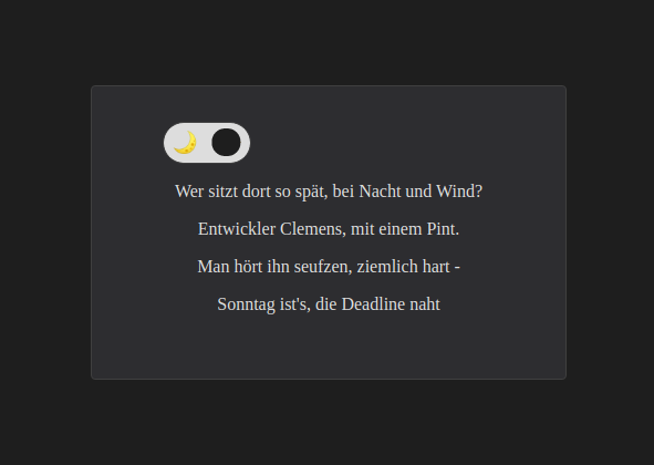
If you open your browser now, you'll note that one core element is still missing: The actual toggle ball. Let's add it next.
Style the switch's toggle
To finalize the switch, add the following to the style - part of the App.vue file:
.switch-toggle {
  position: absolute;
  background-color: var(--background-color-primary);
  border-radius: 50%;
  top: calc(var(--element-size) * 0.07);
  left: calc(var(--element-size) * 0.07);
  height: calc(var(--element-size) * 0.4);
  width: calc(var(--element-size) * 0.4);
  transform: translateX(0);
  transition: transform 0.3s ease, background-color 0.5s ease;
}
Now, almost finished, actually. The toggle looks done, but clicking on it won't result in the usual toggle - effect. To overcome this, we'll use a Vue.js feature - dynamic class binding.
We already have one data property available in our component we can use for that purpose:
// In the script - part of App.vue
data() {
  return {
    userTheme: "light-theme",
  };
},
As you can see in the HTML - template, we're already dynamically binding a class based on userTheme.
<!-- In the template part of App.vue -->
<label for="checkbox" class="switch-label">
  <span>🌙</span>
  <span>☀️</span>
  <div
    class="switch-toggle"
    :class="{ 'switch-toggle-checked': userTheme === 'dark-theme' }"
  ></div>
</label>
So let's add this class's definition in our style - part:
.switch-toggle-checked {
  transform: translateX(calc(var(--element-size) * 0.6)) !important;
}
That wraps up the styling of the switch. Finally, let's add the functionality to handle light - and dark mode.
Implement the dark-mode switch
All left to do is to dynamically add and remove the .dark-mode and .light-mode class to our window root element. Based on that, one of the two root-variable scopes will be enforced. To round things up, we'll also use localStorage to add some persistence.
Manually toggle between the themes
Start by adding the following method to the script part of the App.vue file:
methods: {
  setTheme(theme) {
    localStorage.setItem("user-theme", theme);
    this.userTheme = theme;
    document.documentElement.className = theme;
  }
}
Next, we will need to consider what happens when the user clicks on the switch. We want to read out the local storage value for the user theme and, based on it, execute the setTheme method form above. Let's add the next method straight away:
toggleTheme() {
  const activeTheme = localStorage.getItem("user-theme");
  if (activeTheme === "light-theme") {
    this.setTheme("dark-theme");
  } else {
    this.setTheme("light-theme");
  }
}
Recognize user preferences
The final step is to initially set a user theme based on the user's browser settings. To do so, we'll make use of the (prefers-color-scheme: dark) CSS selector. It is available to Javascript's window.matchMedia() method and returns true if our user's browser prefers dark themes, or false if not.
Let's add this code piece to the App.vue file's methods section. It will be called by the already available mounted() method when the app loads.
getMediaPreference() {
  const hasDarkPreference = window.matchMedia(
    "(prefers-color-scheme: dark)"
  ).matches;
  if (hasDarkPreference) {
    return "dark-theme";
  } else {
    return "light-theme";
  }
},
Remember the user's current preference
While it's already convenient to recognize a visitor's system settings, you can even go further. Assuming a user views your page in dark mode, it will bounce back once the browser closes. You can persist their choice with a few more lines of code
getTheme() {
  return localStorage.getItem("user-theme");
},
Finally, let's add the initial theme setting to the mounted - lifecycle hook.
If the user had no previous preference, your app will simply fall back to their system settings
mounted() {
  const initUserTheme = this.getTheme() || this.getMediaPreference();
  this.setTheme(initUserTheme);
},
And that's it. You'll now be looking at a fully functional theme switch, ready to be thrown into any new or existing project. Try and give it a shot, maybe play around with the element sizes and calc() a bit to find the fitting size for your appliance.
Further reading
While fairly simple to customize, there's some learning to be done to correctly implement a fully-fledged dark theme for your website. Check out the following links to learn more on the topic and find some useful resources
Material design and dark colors
Material Design
Build beautiful, usable products faster. Material Design is an adaptable system—backed by open-source code—that helps teams build high quality digital experiences.
A color palette finder for your next dark theme
Color Palettes dark
Over 0 color palettes listed created by color hex users, discover the new color palettes and the color scheme variations.
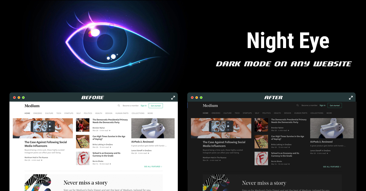
A web app to create a dark CSS theme for your website
Dark CSS theme generator | Night Eye
Vue 3 + TS + Composition API component
<script setup lang="ts">
import { ref, onMounted } from 'vue';

export type UserTheme = 'light' | 'dark';

const setTheme = (theme: UserTheme) => {
  localStorage.setItem('user-theme', theme);
  userTheme.value = theme;
  document.documentElement.className = theme;
};

const getTheme = (): UserTheme => {
  return localStorage.getItem('user-theme') as UserTheme;
};

const toggleTheme = (): void => {
  const activeTheme = localStorage.getItem('user-theme');
  if (activeTheme === 'light') {
    setTheme('dark');
  } else {
    setTheme('light');
  }
};

const getMediaPreference = (): UserTheme => {
  const hasDarkPreference = window.matchMedia('(prefers-color-scheme: dark)').matches;
  if (hasDarkPreference) {
    return 'dark';
  } else {
    return 'light';
  }
};

const userTheme = ref<UserTheme>(getTheme() || getMediaPreference());

onMounted(() => setTheme(userTheme.value));
</script>

<template>
  <button @click="toggleTheme">
    <span v-if="userTheme === 'dark'">
      <svg
        xmlns="http://www.w3.org/2000/svg"
        class="icon fill-current"
        fill="none"
        viewBox="0 0 24 24"
        stroke-width="2"
      >
        <path
          stroke-linecap="round"
          stroke-linejoin="round"
          d="M20.354 15.354A9 9 0 018.646 3.646 9.003 9.003 0 0012 21a9.003 9.003 0 008.354-5.646z"
        />
      </svg>
    </span>
    <span v-if="userTheme === 'light'">
      <svg
        xmlns="http://www.w3.org/2000/svg"
        class="icon"
        fill="none"
        viewBox="0 0 24 24"
        stroke="currentColor"
        stroke-width="2"
      >
        <path
          stroke-linecap="round"
          stroke-linejoin="round"
          d="M12 3v1m0 16v1m9-9h-1M4 12H3m15.364 6.364l-.707-.707M6.343 6.343l-.707-.707m12.728 0l-.707.707M6.343 17.657l-.707.707M16 12a4 4 0 11-8 0 4 4 0 018 0z"
        />
      </svg>
    </span>
  </button>
</template>
